So with the new update with the user interface (which I mostly quite like, btw) I have an issue with the way my algo names are displayed. The names are cut-off (see images below), which for me is quite important because that’s where I keep the version I am on for that current build. This was brought up before in another thread (couldn’t find it to link) but in regards to algo names on the PLAY page as opposed to the MY ALGOS page. It wasn’t a big deal with play page (in my opinion) since I knew which algo I had selected, but now it is quite difficult for me to keep track of which algo I am looking at. It would be great the name could extend to fit or wrap around. Space isn’t really an issue for larger screens and I feel you should be able to see the full name. It is, of course, possible to find the name by opening developer tools, but this is very inefficient and easy to lose track.
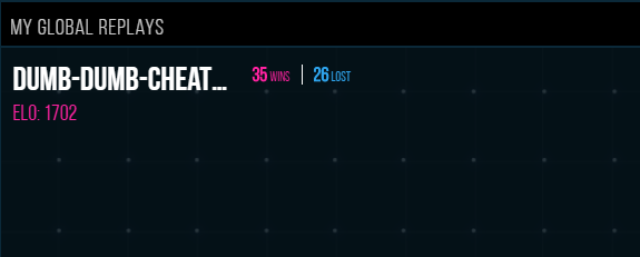
Side note: I really like being able to see how many wins and losses, but another number that would be nice to have is win/loss ratio, since that 's usually what I care more about when comparing algos that have played different number of games.